Circles by Diseo App Redesign

Circles by Diseo is a social media and commerce application designed to empower communities by facilitating services, communication, and member engagement.

Project Summary

Success Criteria

Lead UI/UX Designer

ROLE

Lead UI/UX Designer

TEAM

2 UI/UX Designers,
2 Developers,
1 Project Manager,

Duration

01.08 .2024 - 02.12 .2024

Tools Used

Figma, Notion, Slack,
Typeform

Problem Statement

Why the Re - Design was necessary

Circles by Diseo is designed to be a secure, community-driven social networking app, allowing users to connect through private invites, encrypted messaging, and business networking. However, despite its strong privacy-focused features, the app faced several usability and engagement challenges that called for a major UX redesign.

Key Challenges Identified

Through user feedback, internal discussions, and analytics, we uncovered several pain points that affected user engagement, onboarding, and messaging experiences. These included:

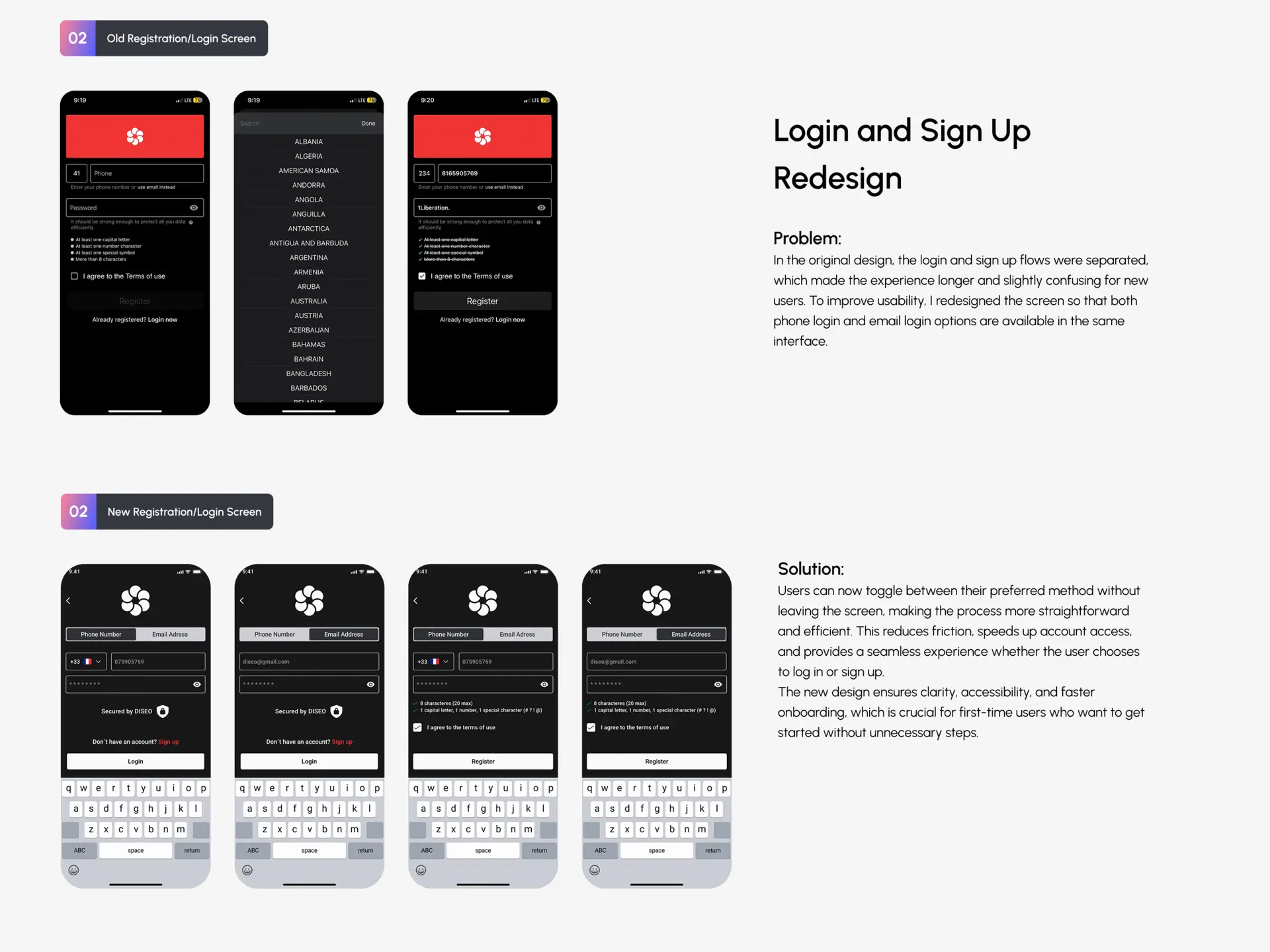
1. Friction in the Onboarding Process

  • Many users who received private invites did not complete registration, leading to high drop-off rates.

2. Poor Invitation Flow & Follow-Ups

  • Users forgot to respond to invites, as there were no proper follow-up notifications via SMS or email.
  • Business invitations required recipients to download the app first, causing friction. Instead, allowing them to preview the profile via a web page could provide a smoother experience.
  • Many users who received private invites did not complete registration, leading to high drop-off rates.

3. Weak Profile Engagement & Completion

  • Users lacked motivation to invite others, as they weren’t reminded of the platform’s benefits, such as data protection, earning opportunities, and community growth.

4. Messaging & Chat Issues

  • Users struggled with unread message tracking, making conversations feel disconnected.
  • There was no option to edit or correct messages in 1-on-1 and group chats.
  • Users couldn’t pin important chats or manage archived messages efficiently.

5. Permission & Notification Issues

  • Users had limited control over message and invite permissions—there was no way to filter notifications to only receive invites from verified profiles.
  • Android notifications were less visible than on iOS, causing some users to miss important messages.
  • There was no “silence time” feature to allow notifications to be muted between 12 AM – 8 AM without completely turning them off.

Redesign Goals & Objectives

To address these challenges, we structured the redesign around five key focus areas:

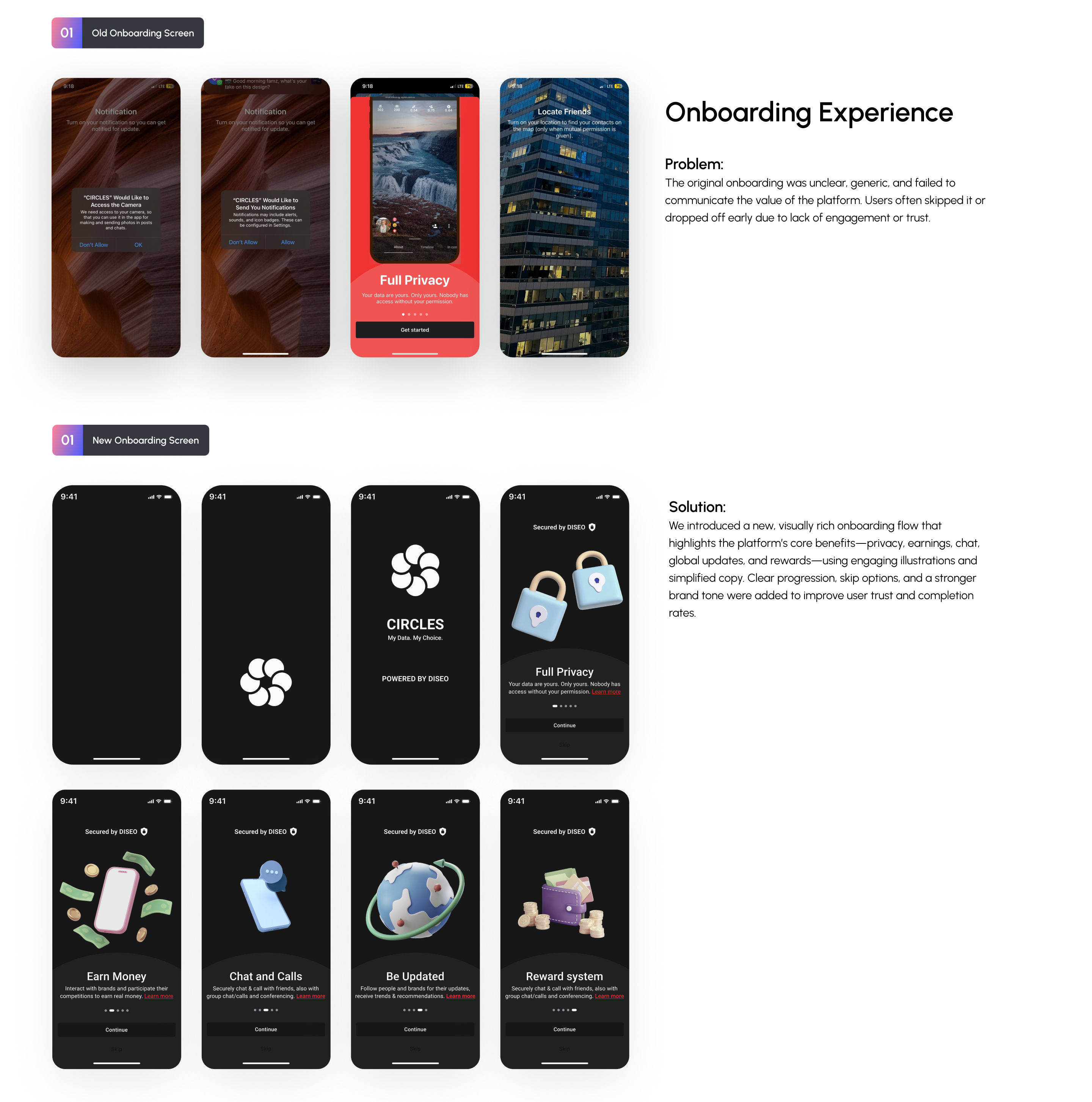
1. Streamlining the Onboarding Process

  • Making the welcome page more engaging and informative with clearer messaging.
  • Introducing pre-registration (capturing user details before they download the app).

2. Optimizing the Invitation Flow

  • Adding follow-up reminders via SMS and email for unanswered invites.
  • Allowing business invite recipients to view profiles on a web page before downloading the app.

3. Enhancing Messaging & Chat Experience

  • Improving unread message tracking and prioritization.
  • Adding message editing, pinning, and improved search features.

4. Improving Profile Management & Engagement

  • Designing a new verification icon to highlight trusted users.
  • Introducing achievement medals (e.g., “Most Active Profile”) to boost engagement.

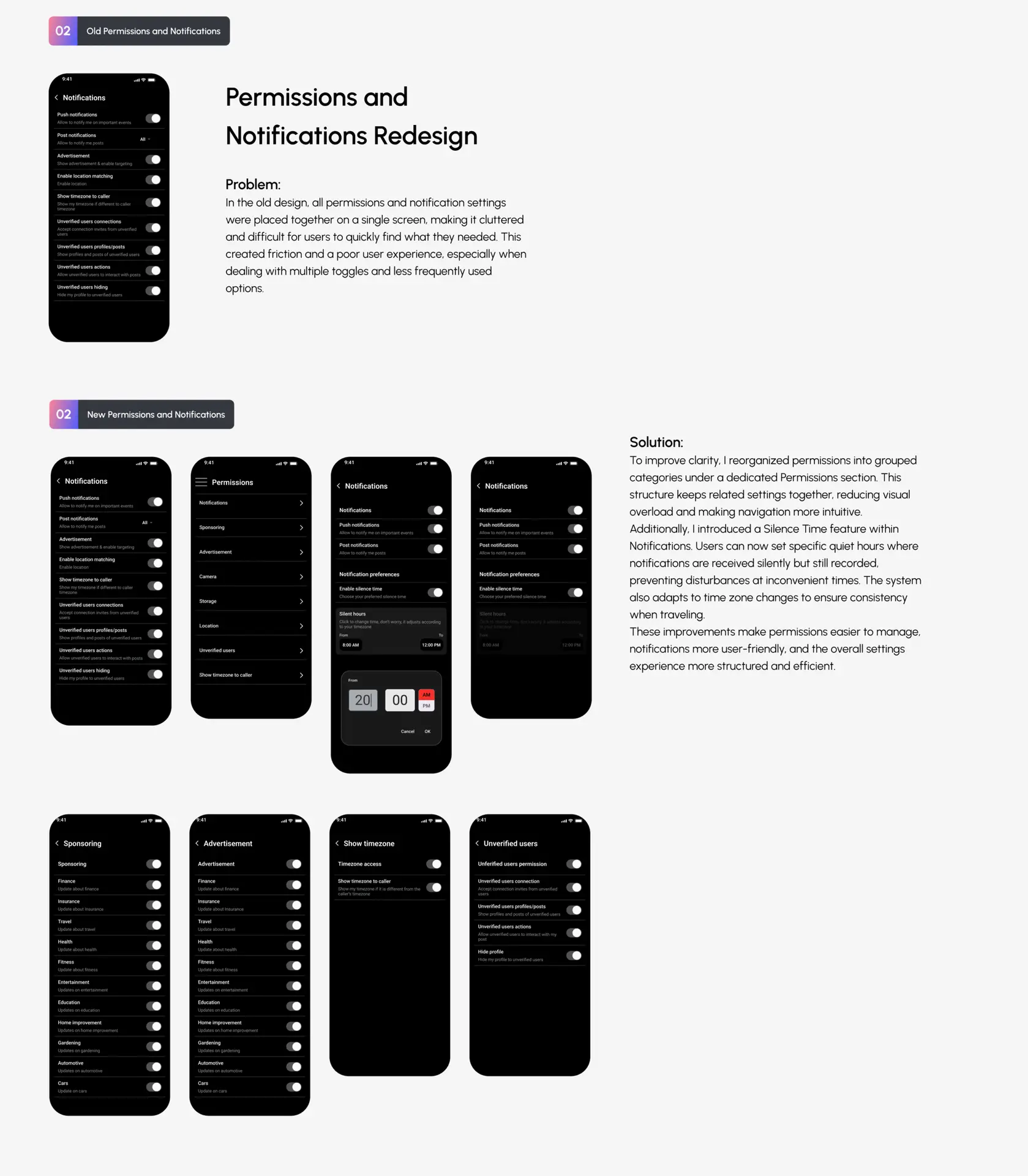
5. Refining Notification & Permission Controls

  • Implementing better notification settings, including silent hours (12 AM – 8 AM).
  • Adding sub-permissions for advertising preferences based on industries (finance, education, travel, etc.).

Research & Discovery

To better understand the user experience issues in Circles by Diseo, I conducted user interviews, surveys, and competitive analysis. This research helped identify the pain points and areas of improvement for the redesign.

User Interview

After surveying a total of 50 users and documenting 10 users and their responses, I discovered four main reasons users encountered frustrations while using the app.

Key insights from survey responses
  1. Onboarding issues: Users struggled with understanding what to do after signing up.

  2. Notification problems: Android and IOS users reported missing important notifications.

  3. Invitation flow issues: Users found the invite messages impersonal and unengaging.

  4. Profile completion challenges: Many users did not see the value in completing their profiles.

  5. Chat & Messaging concerns: Users had difficulty tracking unread messages and needed better organization.

competitors analysis

To benchmark Circles by Diseo against similar platforms and identify best practices, I conducted a competitive analysis of major players in the social networking and business communication space. The focus was on onboarding experience, engagement features, messaging system, and notification reliability.

Discord

Community Engagement & Messaging

Facebook

User Engagement & Notifications

LinkedIn

Professional Networking & Profile Completion

user personas

Katija

To better understand users who run independent businesses and use Circles for networking, we developed Katija’s persona.

Details
  • Age: 31

  • Location: Croatia

  • Occupation: Ceramist

  • Annual Salary: $50K

Use Case

1. Uses social platforms to  promote her handmade ceramic products.

2. Finds onboarding confusing and struggles to find relevant communities.

3. Needs better profile completion prompts to showcase her work.

Emmanuel

Emmanuel’s persona represents fresh graduates entering the professional space and looking for networking opportunities.

Details
  • Age: 24

  • Location: Poland

  • Occupation: Project Management

  • Annual Salary: $30K

Use Case

1.Wants to build his professional network and connect with mentors.

2.Feels overwhelmed by the app’s interface during onboarding.

3. Seeks a clear structure for discovering networking communities.

Wireframes

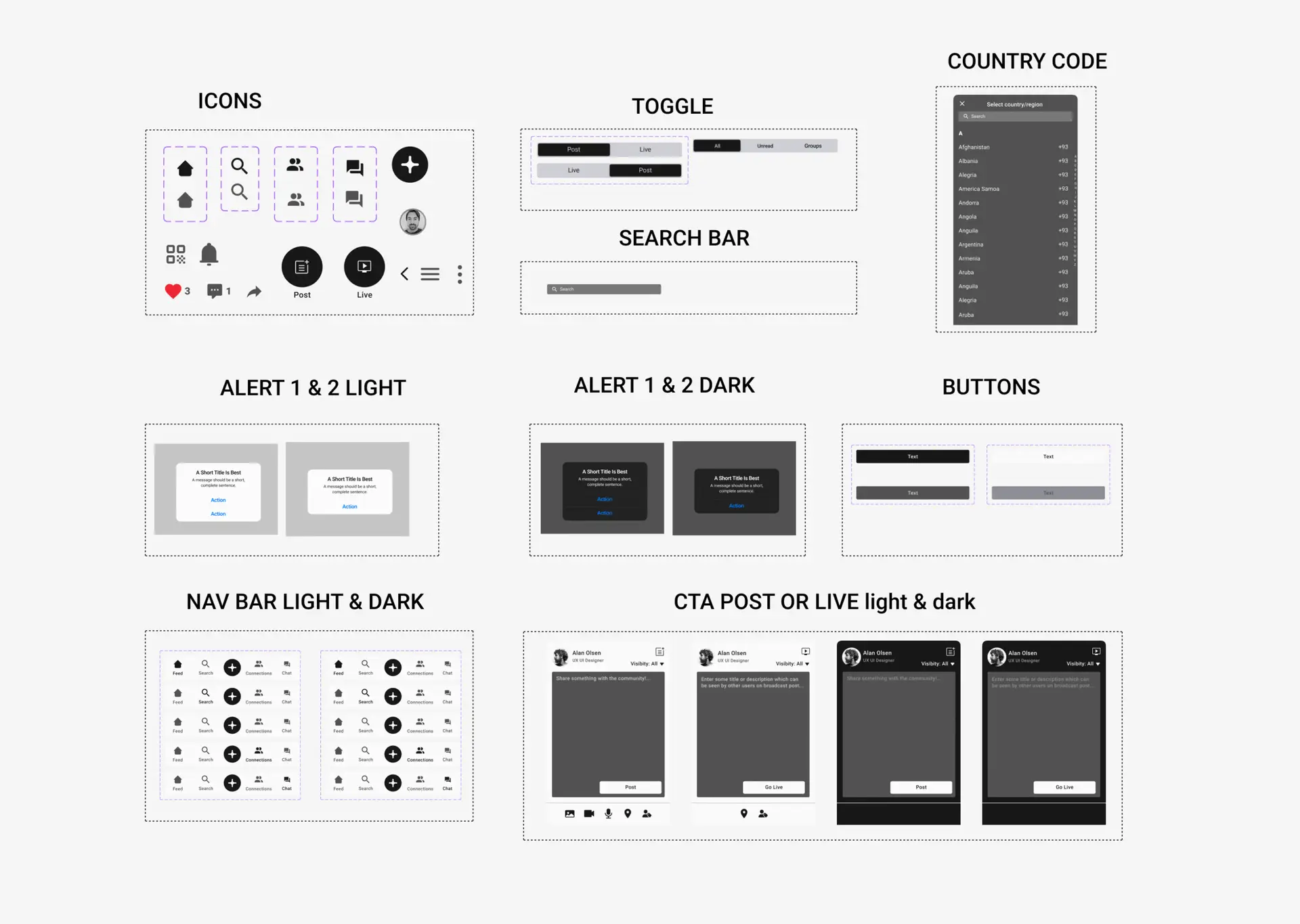
COLORS

TYPOGRAPHY

COMPONENTS

USER FLOW

UX Solutions & Design Improvements

User Acquisition Features

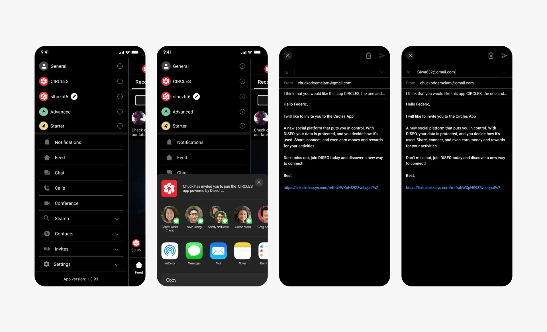
Email and iOS Mail Integration :

Users can invite contacts directly through their mail apps, lowering the barrier to entry.

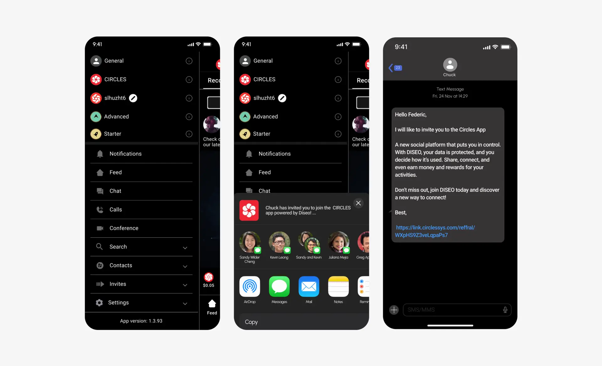
Tell a Friend via SMS :

I envisioned and designed a quick-share option through messaging makes it effortless for users to recommend the app.

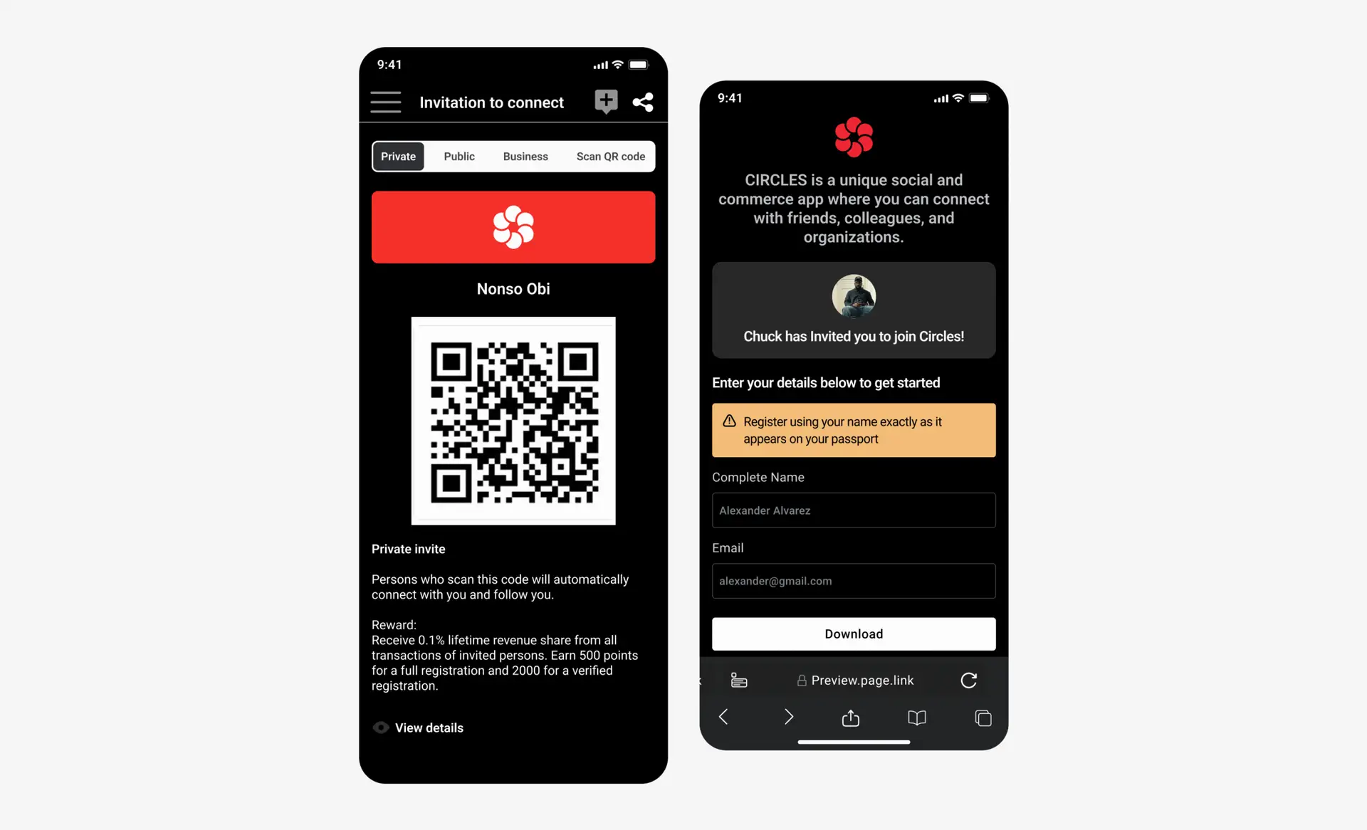
Private QR Code Invitations :

Each user receives a personal QR code that can be shared in person or online, enabling secure and direct connections.

Chat, messaging, and profile conversations

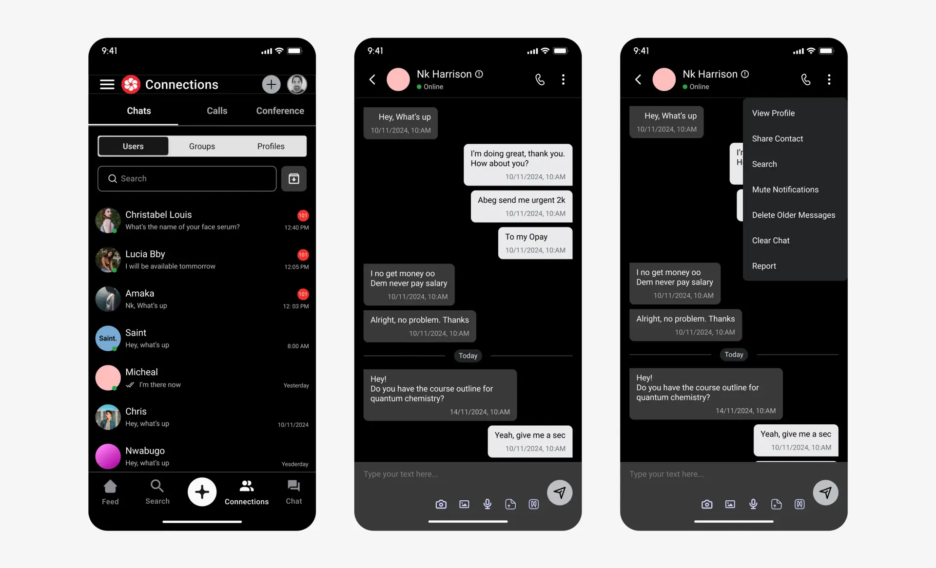
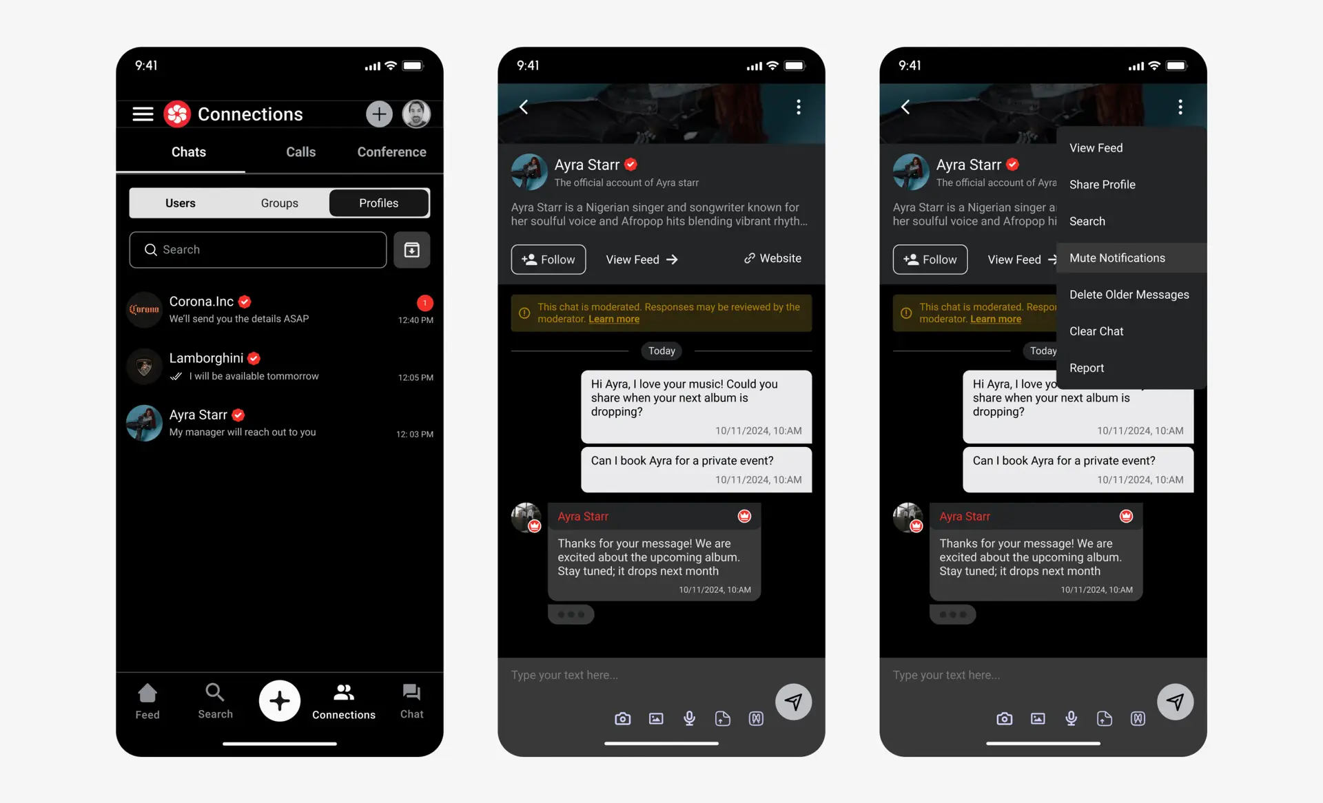
1 to 1 chat :

I refined the core conversation screen for clarity and speed. The online status sits directly under the participant name for instant presence awareness. The send button is larger and easier to hit, and the layout shows more messages before scrolling. Users can edit or correct a sent message. I added an Add contact action that saves the participant to the device contacts. I also defined a More menu for secondary actions, share contact, view details, report, block, clear history, pin chat, with share contact prepared for a follow up build.

Chat profile :

From any conversation, users can open the full profile with one tap. I added mute with a clear state so notifications are silenced without confusion. Chats can be pinned to the top for quick access. History controls support delete, clear, and archive, and archived conversations are searchable, so older threads remain easy to find without cluttering the main list.

Group chat :

Group conversations now show each participant’s profile type, participant or moderator, to set expectations and improve trust. The send button is larger, unread count is always visible, and a dedicated search screen helps users find messages, people, and media inside the thread. I added history management tools for large rooms, and a visible host badge with the ability to transfer hosting rights. Media cards display who shared each item. Users can scroll back to older messages and can delete or edit their own messages.

Educate users, in app guidance

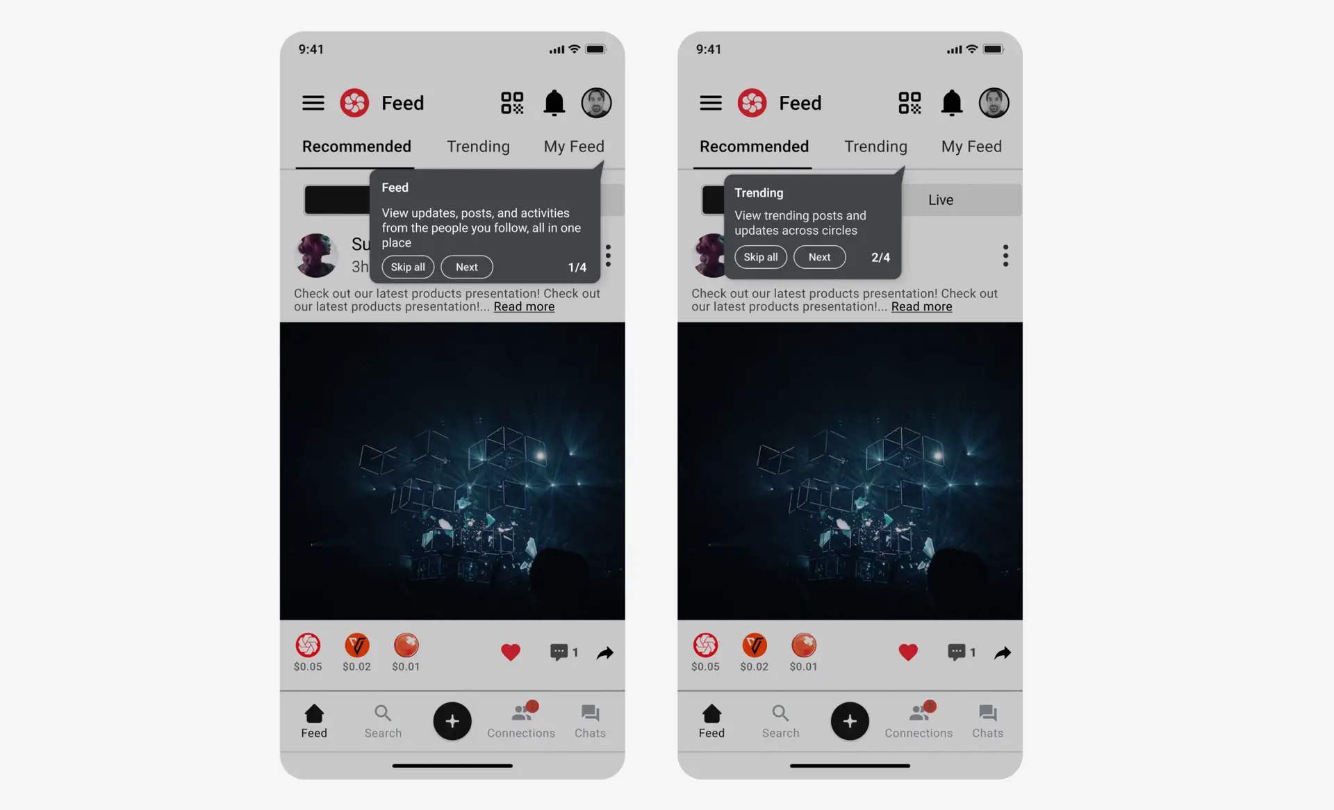
New users often reach the home screen without knowing what each control does. I added a light set of tooltips, inlay hints, and gentle nudges that teach the core flows without getting in the way. Guidance appears at the right moment, it is short, it can be dismissed with one tap, and it never blocks a primary action.

Tooltips on Feed :

On the first sessions, small tooltips point to the tab bar and the post action row. Copy is one line and action first, for example, Switch tabs to shape your feed. Dismiss with Got it or by tapping outside. The tips do not return once completed.

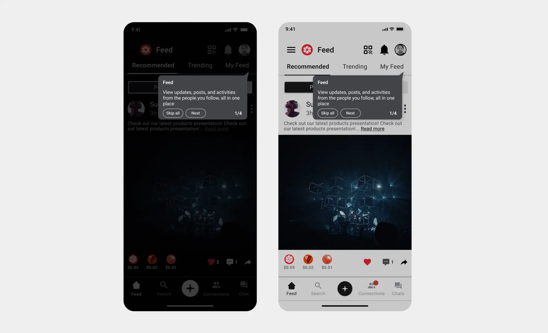
Dark and light screen modes

To support comfort in different environments, I introduced a full theme system with dark and light modes. The app follows the device setting by default and also includes a quick toggle in settings. Color tokens keep brand tone consistent across both themes and ensure the same layout reads clearly in any lighting. Dark mode uses soft neutrals to reduce eye strain, light mode keeps strong hierarchy with clear surfaces and shadows.

Tooltips on Feed :

I designed the interface to be usable for people with visual, motor, and cognitive impairments. Key choices:

  • Contrast and color, text and icons meet or exceed WCAG targets, small text at least 4.5 to 1, large text at least 3 to 1. Status is never color only, every color state has an icon and label.

  • Scalable type, the app respects system text size, dynamic type, and keeps line length readable as sizes increase.

  • Touch targets, all primary actions meet recommended touch sizes, with generous spacing to avoid accidental taps.

  • Screen reader support, every actionable element has a clear label, hint, and value. Reading order matches the visual order, custom actions are exposed where useful.

  • Motion and focus, animations are calm and respect the system setting for reduced motion. Focus and selection states are always visible.

  • Haptics and feedback, success, warning, and error states include text, icon, and gentle haptic cues for clarity.
Impact: Better readability in bright and low light, fewer input mistakes, and a smoother experience for users who rely on assistive technology.